How to Integrate Tailwind CSS with Pure HTML

Tailwind CSS is a class-based and utility-first CSS framework that has helped me speed up the process of styling my web pages in recent years. For instance, I use it on all of my Frontend Mentor challenges. As a free user, I don’t know the exact size of a component because I don’t have access to its Figma design. With Tailwind, I can estimate it better using its predefined sizes.
This guide is for those who want to integrate Tailwind directly into HTML without utilizing web frameworks or libraries (e.g. React, Vue, Angular). I recommend installing Live Server extension (if you are using VS Code) or live-server globally beforehand, as this allows you to serve the page locally and automatically refresh it whenever changes are made.
First of all, create a project directory and index.html:
mkdir tailwind-html
cd tailwind-html
touch index.html
Next, initialize package.json using your preferred package manager. In this case, I am using Yarn:
yarn init -yInstall Tailwind as a dev dependency and generate tailwind.config.js by running the following command:
yarn add tailwindcss -D
npx tailwindcss init
To have Tailwind detect every HTML file, add ./*.html to the content property inside tailwind.config.js:
module.exports = {
  content: ['./*.html'],
  theme: {
    extend: {},
  },
  plugins: [],
}
Create a CSS file called tailwind.css and add Tailwind directives:
@import 'tailwindcss/base';
@import 'tailwindcss/components';
@import 'tailwindcss/utilities';
Create a script called dev:css and run it using the yarn dev:css command. This will compile tailwind.css into a new file called style.css. Read on to learn why.
{
  "scripts": {
    "dev:css": "tailwindcss -i ./tailwind.css -o ./style.css --watch"
  }
}
In our index.html, import style.css instead of tailwind.css. style.css is a compiled version of tailwind.css, which eliminates unused classes and styles and only retains the ones we need. This results in more efficient code.
<!DOCTYPE html>
<html lang="en">
  <head>
    <meta charset="UTF-8">
    <meta http-equiv="X-UA-Compatible" content="IE=edge">
    <meta name="viewport" content="width=device-width, initial-scale=1.0">
    <link rel="stylesheet" href="style.css" />
    <title>Tailwind + HTML</title>
  </head>
  <body class="flex justify-center">
    <h1 class="text-3xl">Welcome to Tailwind + HTML</h1>
  </body>
</html>
Open a new terminal, run live-server --host=localhost, and open localhost:8080 in the browser. Your web page will look like the example below. As we make changes to any class, dev:css will automatically recompile style.css for us.

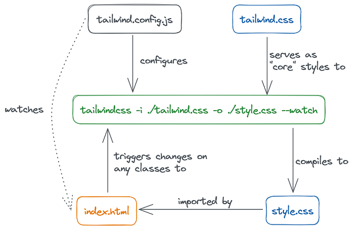
To sum it up, the flow is pretty much like this:
One more thing! Before deploying to production, make sure to minify style.css first. This will reduce its size and improve loading speed. You can create a build:css script in package.json and run it:
{
  "scripts": {
    "dev:css": "tailwindcss -i ./tailwind.css -o ./style.css --watch",
    "build:css": "tailwindcss -i ./tailwind.css -o ./style.css --minify"
  }
}
Thank you for reading this guide. I hope that the steps outlined here have been helpful to you.