New Logo (Kind Of)
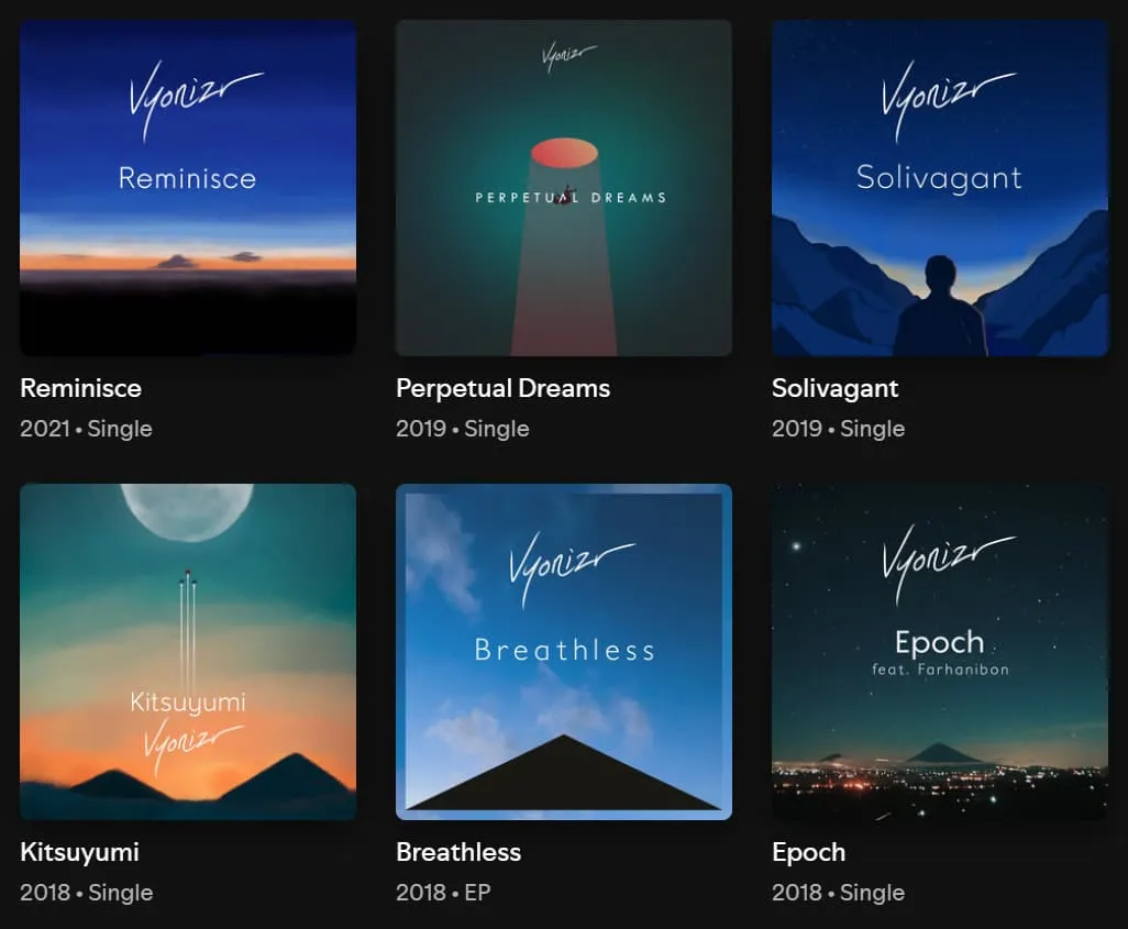
One evening in 2017, I picked up a piece of scrap paper and grabbed a pen during some free time at college. I casually stylized the letters “vyonizr” on the page. After a few attempts, I settled on a pattern. “Hmm, this is cool,” I said to myself. It had firm strokes and fluid lines. Later that evening, I brought it home, turned on my PC, and converted it to a vector format with a few tweaks. I never thought it would accompany me through six music releases: Epoch (2018), Breathless (2018), Kitsuyumi (2018), Solivagant (2019), Perpetual Dreams (2019), and Reminisce (2021). As I took a leap of faith during the turbulent times of my life, music became the outlet for my emotions, and that logo was always there to represent every release.
It stayed that way for a while until 2022, when I felt it needed some improvement. Although it felt very personal, the wordmark was unfortunately too thin to be clearly visible from a distance and took up too much vertical space due to the ascending letters. Furthermore, I had no idea how to extract a standalone logo from it.
So, I made a new one by combining the letters “V” and “R”, but something felt off. It seemed to convey the initials “VR” (Valentino Rossi 🏁? Virtual Reality 🥽?) rather than my own identity. I also got stuck reworking the wordmark, so I never published it and scrapped the project entirely. During this transition, I did not use any logo or wordmark for my music releases.
Then, a few weeks ago, an idea arrived unexpectedly. “Can all letters be made of squares?” I wondered. So, I used a Lego-like approach, designing a wordmark built from hollow squares. The main idea is that the squares can stack on top of each other to form a logo. Initially, the letter “V” was not made of square and rectangular blocks; it was a literal letter with the second line standing straight. An aesthetic improvement was made by replacing the diagonal line with a square, which allowed it to closely mirror the last letter, “R”.
The letter “Z” presented a unique challenge. Making a diagonal line would break the Lego concept. I kept brainstorming until I had a eureka moment: breaking a square in half, placing one half at the bottom-right corner of the upper block, and the other at the top-left corner of the bottom block.
What about the logo? Once the letters are stacked together, rotate the design 45 degrees counterclockwise to see the final form. Try pressing the “Fold Me!” button below.
Surprisingly, it all comes full circle: this new design is remarkably close to one I created 15 years ago! I can’t remember which font I used, but I remember making modifications by flipping the “V” so the diagonal line faced left, and straightening the diagonal line on the “Z” to be vertical.
Perhaps your truest ideas were already there at the beginning. You just needed the long way around to find them again.